Bad hyperlink styling could erode your site’s usability
The hyperlink has long been there ever since the creation of the World Wide Web. It is the fundamental ingredient of a modern website. In most graphical web browsers, default links are displayed in underlined blue text when they have not been visited but underlined purple text when they have. Links could have different visual appearance depending on how they are styled with CSS. However, this could by easily abused that they lost the perceived affordances and become harder for users to differentiate them from regular text.
People rely on their prior knowledge about the web to help them quickly determine which items are clickable. In our case, blue color and underline are all good signifiers of a hyperlink. As long as the blue color is reserved for clickable items only throughout the sites and don’t use blue text or underline text for unclickable ones.

WashingtonPost.com is using both underline and blue on links.
For example, The Verge uses its brand color the hypertext but also use it to highlight quote. This won’t cause a major usability issue, but it will fool users to click on it, forcing them to guess or hover every orange text on the page to find out where they can click.
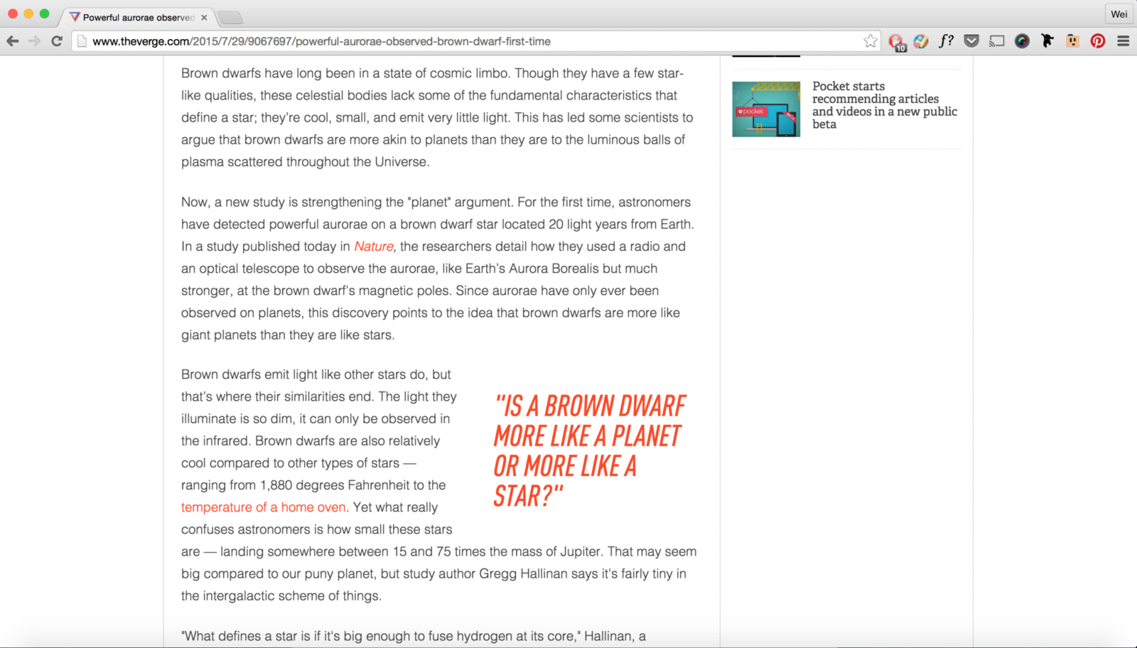
The Verge uses same color on both hypertext and quote, while quote is not clickable.
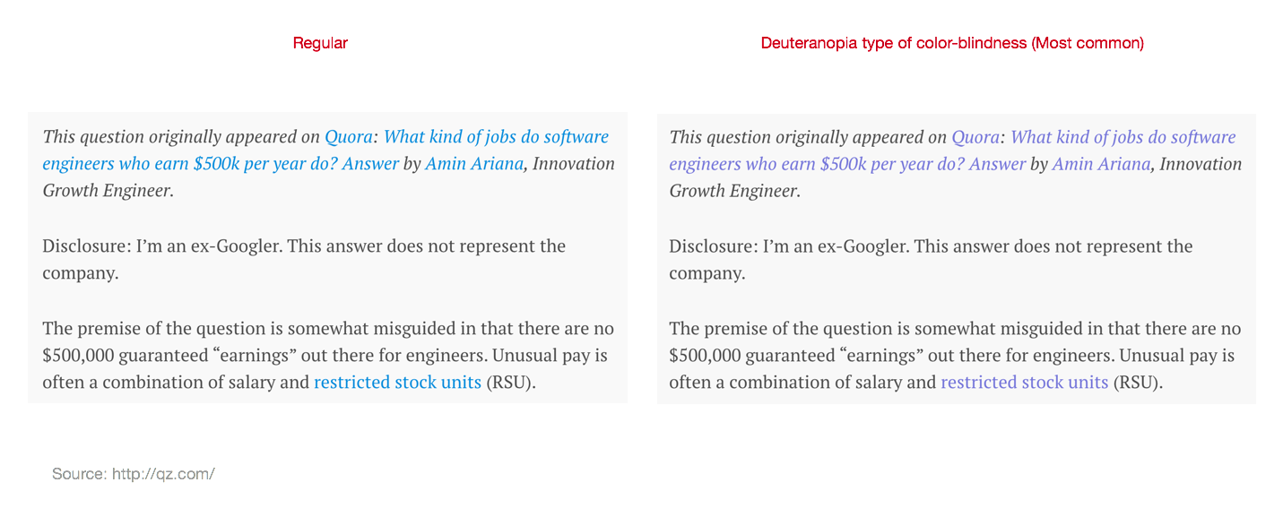
Therefore, Underlining is essential if you use link colors other than blue, especially colors like reds or greens, which are causing problems for users with common forms of color-blindness. For example, CBS News uses dark red for link color, which is hardly recognizable for Deuteranopia type of color-blindness users.

If you’ve decided not to underline links, make an underline appear while hovering, even you are using blue links. CNN uses blue for links but uses CNN red when hovering, which is very subtle changes that less obvious than underlining links.

In sum, there is an order of how style can affect the Affordance of a hyperlink: Underline&blue > Underline > Blue > other colors > bold only. Underlined and blue text looks more like hyperlink than underlined only, than blue only. Underline is a very strong signifier of a hyperlink. While blue is still more reliable indicator than other colors, if the same treatment is been consistently applied to other links but not none-link texts throughout the site. Bold text without other stylings is the least distinguishable styling for links.


References
- Guidelines for Visualizing Links, by JAKOB NIELSEN on May 10, 2004
- 113 Design Guidelines for Homepage Usability, by JAKOB NIELSEN on October 31, 2001
- Beyond Blue Links: Making Clickable Elements Recognizable, by HOA LORANGER on March 8, 2015