Overview
I worked at TheStreet, Inc as a freelance UX/UI designer and collaborated closely with the Director of Product, Shendi Wang and the creative designer, Kieran McBriar to merge their two stand-alone mobile apps into one full-service app.
TheStreet, Inc. is a public American financial news and services website founded by Jim Cramer and Martin Peretz. TheStreet provides readers financial news, analysis and stock ideas through two stand-alone mobile apps – TheStreet and TheStreet Premium. TheStreet Premium features subscription services that combine expert stock market commentary, actionable stock trading advice and are intended to appeal to different segments of the investing public, including fledgling investors, consumers interested in personal finance guidance, long-term and short-term active investors, day and swing traders, and fundamental and technical traders.
The Goals
The primary goal of this project is to use the free content to get more subscriptions by combining two stand-alone mobile apps – TheStreet and TheStreet Premium into one full-service app. Doing so will also improve the marketing and editorial efficiency and reduce the maintenance cost.
The Challenges
The challenges of combining two existing apps are 1) How to combine two stand-alone apps seamlessly so that pre-existing users from both sides are not overwhelmed and could still find content easily. 2), How to handle the user migration unintrusively and effectively. 3) Forced to make quick design decisions based on well known best practice without the luxury of doing user research and user data.
Understand the structures of the two apps
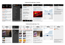
I spent the first several weeks understanding the two apps, including the similarities and difference in terms of IA, user bases, and content. Both apps’ structures are pretty identical. Both have a stock index panel, search and a streamline news feed on homepage. Both adopt a hamburger menu where sections, settings, and login live.
Replacing Hamburger Menu with Tab Bar
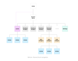
Both the Premium and Free Apps are using a hamburger menu for navigation. Hamburger menu is a hierarchical navigation. To go to another destination, users must retrace their steps or start over from the beginning and make different choices. I convinced the team to replace it with a flatter navigation. Flat navigation among news stream, categories, and settings, allowing for switch between multiple categories and articles. Hierarchical navigation within each category. Many studies have shown that using a tab bar instead of the hamburger menu increase the engagement and active time on the app. The other benefit is it requires fewer taps from users and keep the content in previous tap intact so users can back to where they were easily.
There are many reasons here:
- It increases the visibility of menu – out of sight, out of mind;
- Many apps have adopted the tab-based menu including Facebook, YouTube, and they have seen an increase in terms of engagement and menu usage;
- Tab-based menu is the official iOS design practice. The hidden sidebar nav was considered a classic Android design style for menu nav, but now even Google has brought the tab-based menu to their design guideline.
Utilize swiping gesture to facilitate continuous reading
To reduce the friction of reading, I introduce swiping gesture to allow readers swipe on the article screen to read previous or next articles. While I keep the back button in the navigation bar at the top, which is a conservative decision in favor of the relatively senior demographic of TheStreet users, swiping on the edge does bring them back to the previous location. The goal is to allow them to comfortably navigate through the app using only one hand.


